I can tell how well a team's board is serving them from one thing in standup: whether they are looking at it, or scrolling along it.
Scrolling is the tell. It means the board no longer fits the work, and a board that does not fit the work has quietly stopped doing the one job it exists for. That job is not storage, and it is not decoration. It is to make the state of the work visible to everyone at the same instant. The moment part of that work slides off the edge of the screen, the board is lying by omission.
What the board is really for
When the whole team can see every story and every status in a single glance, three good things happen almost on their own:
- Bottlenecks announce themselves. A column quietly filling up is a signal everyone sees at once, not something you discover a week too late.
- Standup is about the work. People talk about what is blocked and what is close, instead of reading a status report aloud.
- Nothing hides. Work that has stalled cannot disappear into a lane nobody scrolls to.
Take away the single view and all three go with it. A board you have to scroll is just a list wearing a costume.
How tools quietly break this
Most tools look fine at first. Three or four columns, everything fits, life is good. Then your real workflow shows up. Picture a perfectly ordinary software team's board:
Backlog → In progress → Code review → QA → Waiting on customer → Ready to deploy → Done.
Seven lanes, and not one of them is padding. Every step is a genuine state work passes through. But seven columns is precisely where a lot of tools fall over, and they fall over in one of two ways.
Either they make you scroll horizontally, so you can never take in the whole board at once, or they nudge you to hide columns to make it fit. The second is worse, because now the board is actively misleading you: the QA column could have eight stuck stories in it and nobody at standup would know, because QA is parked off the right edge of the screen.
I hit this wall myself, more than once, on tools I otherwise liked. It is one of the specific frustrations that led me to build Scrumpy as a Linear alternative: past six or seven lanes, a lot of genuinely lovely tools start hiding your work from you.
Having too many columns is not the problem
Worth saying plainly, because people blame themselves: a detailed workflow is not a bloated one. Plenty of healthy teams have seven or eight real steps in how work flows, and each one earns its place. The problem is never that your process is too detailed. The problem is a board that cannot show a detailed process without breaking.
The fix is not to flatten your workflow to fit the tool. The fix is a tool that can show your actual workflow on one screen.
Signs your board is working against you
A quick gut check. Recognise two or more of these and the board itself is your bottleneck:
- People scroll the board during standup instead of looking at it.
- Someone has hidden columns "to keep it manageable."
- Work goes quiet in a late-stage column and nobody notices for days.
- Team members keep a private side-list because the board does not show the full picture.
- Adding a genuinely useful column feels risky, because it will not fit.
What a board should do instead
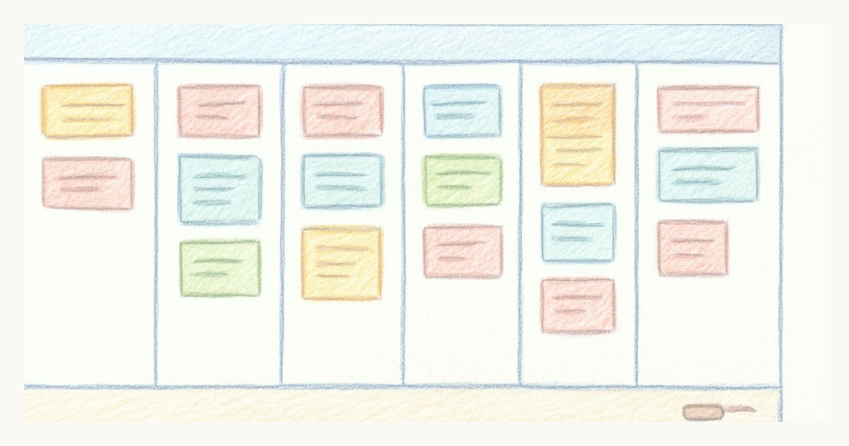
A board that respects how teams actually work shows every column on one screen. Concretely, that means it:
- Fits. The whole sprint, every column, visible at once, no horizontal scrolling.
- Handles many lanes gracefully. When you do run a lot of columns, collapse the ones you are not focused on into a slim vertical strip. Collapsing is not hiding: the column is still there, still counted, just folded away until you want it. In Scrumpy that choice is remembered per person, so your view stays yours.
- Stays readable. Cards show enough at a glance to be useful, the title, the assignee, the priority, without a click into each one.
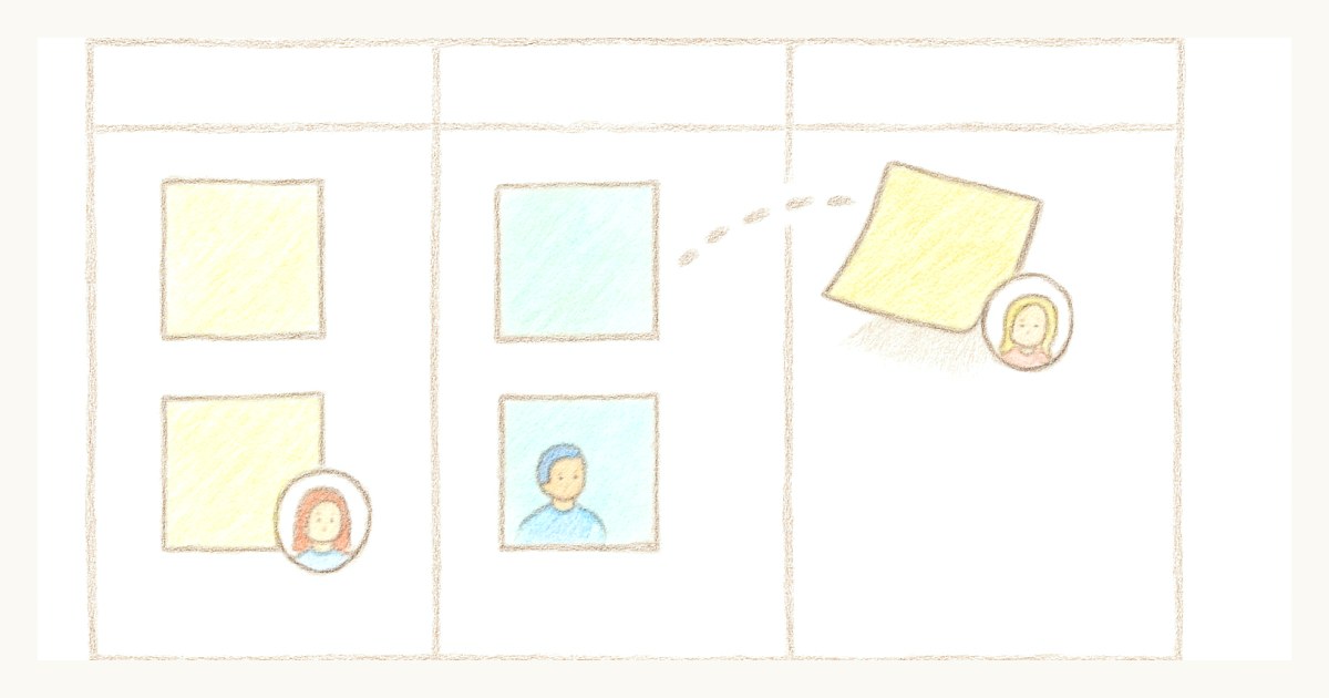
- Does the small chores for you. Moving a story into an in-progress lane can hand it to whoever picked it up, automatically, so keeping the board honest costs no effort.
The goal is easy to say and harder to find: maximum visibility for minimum fuss.
See the whole sprint
If your team has drifted into scrolling sideways or quietly hiding lanes, it is worth noticing what that habit actually costs. The board is the one place the whole team shares a single picture of reality. It should never make you work to see it.
That bar, the whole board on one screen, is not a nice-to-have I bolted on later. It is the reason Scrumpy's board looks the way it does. If the column problem sounds like your Tuesday, start a sprint on it and watch the difference: nothing off the edge, nothing to scroll for, the whole state of the work sitting in front of everyone at once.
Frequently asked questions
How many columns should a scrum board have?
As many as your workflow genuinely needs, but the board should show all of them at once without horizontal scrolling. If a tool forces you to scroll sideways or hide columns past six or seven lanes, that is a limitation of the tool, not your process.
Why is horizontal scrolling on a board a problem?
Because the board's whole job is shared visibility. The moment part of the workflow is off-screen, the team stops seeing the real state of the sprint, work piles up unnoticed in hidden columns, and standup turns into scrolling instead of talking.
What scrum board shows every column at once?
Scrumpy is designed so the entire board fits on one screen, with collapsible lanes for teams that run many columns. See how it compares on our Linear alternative page.