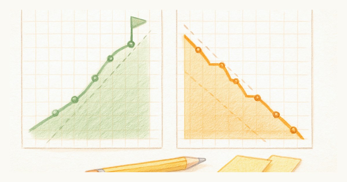
A burndown chart can show your team crushing it right up until the sprint quietly falls apart. The line slopes down, everyone relaxes, and then the last day arrives with three stories still open. Nothing went wrong on the chart. The chart just was not built to show the thing that went wrong.
That thing is almost always scope. Work gets added mid-sprint, a story turns out to be bigger than it looked, "while you're in there" becomes two more tasks. A burndown absorbs all of it into a single line and never lets on. This is the whole reason to understand the difference between a burndown and a burn-up, and to think about which one you actually want on the wall.
Both spellings turn up, burnup and burn-up, and they mean the same chart. This post is about the chart for a single sprint. If you are after a burnup for a whole epic or initiative, that one runs across sprints and has its own walkthrough in epic and initiative burnup charts. Here is the short version for the sprint before the long one.
| Burndown chart | Burn-up chart | |
|---|---|---|
| Plots | Work remaining, falling toward zero | Work completed, rising from zero |
| Where scope lives | Inside the same line as progress | On its own second line |
| Added work looks like | The line flattening or rising, same as slowing down | The scope line stepping up while progress holds its pace |
| Answers | Are we going to finish? | Are we going to finish, and did the target move? |
| Weak spot | Hides scope changes | Two lines to read instead of one |
Both charts are drawn from the same data, so this is not a question of which one is correct. It is a question of what you want the chart to make obvious.
What a burndown chart shows
A burndown plots the work remaining over the days of a sprint. It starts at the total you committed to and aims for zero on the final day. There is usually an ideal line, a straight diagonal down to zero, and an actual line that shows your real pace against it. Above the line you are behind, below it you are ahead.
It is a clean, intuitive picture, and for a stable sprint it works fine. The trouble is the one assumption baked into it: that the total does not move.
What a burn-up chart shows
A burn-up plots the work completed, rising from zero over the same days. But it adds a second line the burndown does not have: a separate line for the total scope of the sprint. Your progress climbs toward that scope line, and the gap between them is the work left to do.
That second line is the entire point. Scope and progress are drawn independently, so when the scope changes, the scope line moves and you see it happen.
Which is better, burn-up or burndown?
Picture a two-week sprint. Day five, the team has burned through half the work and the burndown looks perfect, right on the ideal line. Then someone adds two stories that were "basically already done." On a burndown, that added work pushes the remaining-work line back up, or flattens its descent, and at a glance it reads exactly like the team slowing down. Falling behind and taking on more look identical.
On a burn-up, the same event is unmistakable. Your completed line keeps climbing at the same pace, and the scope line jumps up. The picture says plainly: the team did not slow down, the target moved. Those are two completely different conversations to have at standup, and only one chart lets you tell them apart.
This is not a knock on any particular tool. Jira, for instance, offers both a burndown and a burn-up under its reports, and plenty of teams have quietly switched. It is more that the burndown became the default agile chart by habit, and the default hides the one thing that trips up most sprints. In Scrumpy the sprint chart is a burn-up that climbs toward done against a working-days target line, green when you are ahead of pace and amber when you are behind. One honest caveat, since this whole post is about scope: it plots completion as a share of the sprint as it stands today, so a story added on day five shows up as the percentage dipping rather than as a separate scope line stepping up. The sprint's point total on the sprints page is where you see the scope itself grow.
What the chart is actually for
Whichever you use, be clear on the job. A sprint chart is a forecast, not a report card. It exists to answer one question during the sprint: are we on track to finish what we planned, and if not, what do we do about it now while there is still time to act? It is a tool for the team, not a stick for a manager.
Read that way, the daily glance is a prompt: are we ahead, behind, or has the scope moved? Each answer leads somewhere useful. Behind on pace might mean a story needs help. A jumping scope line might mean it is time to say no, or to move something back to the backlog now rather than let it spill into the next sprint.
Over several sprints the same completed-work data rolls up into velocity, a rough, honest number for how much your team actually finishes. That is what you plan the next sprint against, and it only means anything if your points are sized consistently in the first place. A chart drawn on wishful estimates draws a wishful picture.
Everything above is about one sprint, measured in days. If the question you are really being asked is when a whole epic or initiative lands, across several sprints, that is a different chart with a different failure mode, and we worked through it sprint by sprint in epic and initiative burnup charts, then turned into a date range in forecasting an epic's completion date.
Read it honestly, decide early
The best habit with any sprint chart is to look at it early and often, not to unveil it at the sprint review like a verdict. If the burn-up shows the scope line creeping upward, that is your cue to have the scope conversation on day four, not day nine when the only options left are heroics or a miss.
Set your sprint up so the chart has something honest to draw. A sprint that was planned with a clear, agreed scope gives you a flat, meaningful scope line and a burn-up worth trusting. Then let the chart do its one job: telling you the truth in time to use it.
Frequently asked questions
What is the difference between a burn-up and a burndown chart?
A burndown chart tracks the work remaining, sloping down toward zero as the sprint progresses. A burn-up chart tracks the work completed, climbing up toward a separate line that represents the total scope. The key difference is that a burn-up draws scope as its own line, so when scope changes mid-sprint you can see it, while a burndown blends scope changes into the same line as progress.
What is a burndown chart?
A burndown chart plots how much work is left in a sprint over time, usually measured in story points. It starts at the total committed work and aims to reach zero by the last day. A downward-sloping ideal line shows the pace needed to finish, and the actual line shows how the team is really tracking against it.
What is a burn-up chart?
A burn-up chart plots how much work has been completed over time, rising from zero toward a horizontal line that marks the total scope of the sprint. Because completed work and total scope are two separate lines, added or removed work shows up as the scope line moving, making mid-sprint scope changes obvious rather than hidden.
Which is better, burn-up or burndown?
Neither is wrong, but a burn-up is more honest when scope changes during a sprint, which it usually does. A burndown can look healthy while work is quietly being added, because both effects land on one line. A burn-up separates progress from scope, so you can tell the difference between falling behind and taking on more.