Your sprint chart is green, the sprint will land, and nobody in the room can say when the epic lands. That is usually the question the stakeholder actually asked, and it is the one a sprint chart is not built to answer.
So people go looking for an epic burnup chart. It is a reasonable instinct, and it is worth understanding what that chart does before deciding you need it, because quite often you do not.
What an epic burnup chart shows
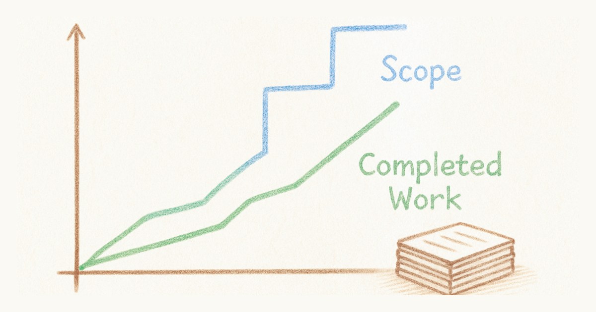
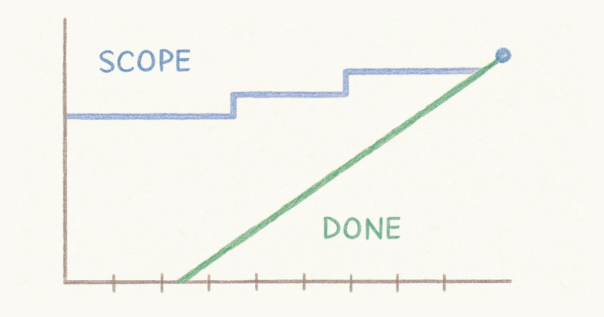
An epic burnup plots completed work across the sprints an epic spans, climbing toward a second line that marks the epic's total scope. Structurally it is the same chart as a sprint burn-up. The only real change is the horizontal axis: sprints or weeks in place of the days of one sprint.
That sounds like a small change. It is not. A sprint is two weeks, and scope creep inside one is measured in a story or two. An epic can run a quarter, and over a quarter scope moves constantly. Work gets discovered, a story splits into four, someone remembers the migration. The second line, the one that exists purely to show scope moving independently of progress, does considerably more work on an epic chart than it ever does on a sprint chart.
What does an epic burnup chart look like?
Here is a worked example. The numbers are made up, but the shape is one I have watched play out more than once. An epic is planned at 80 points. The team finishes around 18 points a sprint, give or take.
| Sprint | Finished this sprint | Done so far | Epic scope | Still to do |
|---|---|---|---|---|
| Planning | 0 | 0 | 80 | 80 |
| 1 | 18 | 18 | 80 | 62 |
| 2 | 17 | 35 | 80 | 45 |
| 3 | 19 | 54 | 96 | 42 |
| 4 | 16 | 70 | 96 | 26 |
| 5 | 18 | 88 | 110 | 22 |
| 6 | 17 | 105 | 110 | 5 |
| 7 | 5 | 110 | 110 | 0 |
After sprint 2, the forecast looks easy. There are 45 points left and the team does about 18 a sprint, so the epic lands in sprint 5. It actually lands in sprint 7.
Plot the two lines and you can see why. The done line climbs at the same steady pace the whole way, from 18 to 35 to 54 and on up to 110. The team never slowed down. The scope line is the one that moved: it jumped by 16 points in sprint 3, when the team found a data migration nobody had planned for, and by another 14 in sprint 5, when one large story turned out to be four. Each jump pushed the finish line away just as the done line was closing in.
Now look at the last column on its own, which is all a burndown draws. The remaining work drops by 17 in sprint 2, then by only 3 in sprint 3. On a burndown that reads as the team stalling, and that is how the conversation in the sprint review goes. On the burnup, nobody has to argue about it. The team kept its pace, and the epic got bigger.
The chart earns its place by showing that difference.
The default epic report is a burndown, which is backwards
Here is the part that has always struck me as odd. Jira's epic-level report is called Epic Burndown. Not burn-up. The chart most teams reach for at epic level is the one that folds scope changes and progress into a single line.
Run that against the time windows. At sprint level, where scope is relatively stable, a burndown is mostly fine. At epic level, where scope is least stable, the burndown is the default. The chart hides the exact thing that gets less stable the longer you look.
To be fair to Atlassian, Jira offers burn-up charts too, and their epic reporting does more than draw one line. The point is about what teams inherit as the default, and defaults are what most people actually use.
Where "initiative" comes into this
If you searched for an initiative burnup rather than an epic one, you are probably a level higher again. An initiative is typically a body of work above epics, spanning several teams, usually over a quarter or more.
Worth saying plainly: initiative is portfolio vocabulary, not Scrum vocabulary. Scrum defines a product backlog and a sprint backlog and nothing above them. Even epics and stories and tasks are a convention rather than part of the framework. Tools built for scaled portfolio management introduced the initiative layer, and it makes sense in the context those tools serve.
It also means that if you are genuinely coordinating initiatives across several teams and need to compare their delivery against each other, you want a portfolio planning tool. That is a real category with real products in it, and Scrumpy is not one of them. Scrumpy is built for a team that wants its board to load and its backlog to make sense.
What about a team comparison burnup report?
This is the version of the chart that gets asked for once an initiative has three teams on it: each team's burnup drawn side by side, so someone can see who is ahead. I understand the appeal. I also think it is the one burnup report that does more harm than good when it is read in points.
Story points are relative to the team that estimated them. A five on one team and a five on another are not the same amount of work, and they were never meant to be; the whole point of relative sizing is that each team calibrates against its own past stories. Put two teams' point totals on one chart and the team that estimates generously looks fastest. Tell the teams they are being compared and, within a couple of sprints, every team estimates generously.
The version that survives is percentages. Each team's done line as a share of its own scope, drawn on the same axis. That tells you something true: which team's slice of the initiative is closest to finished, and which scope line keeps climbing. It says nothing about which team is better, and nobody should pretend it does.
The question behind the chart
Most of the time, someone asking for an epic burnup does not want a chart. They want a date.
There are two numbers that give you one. The story points remaining in the epic, and your average velocity per sprint. Sixty four points left, a team that finishes around eighteen a sprint, that is three and a half sprints, so call it four. You just forecast the epic in your head, without opening a reporting tab, and the answer is about as accurate as the chart would have been.
I would rather hand a team that arithmetic than a chart, most days. It is faster, it is legible to everyone in the room, and it does not create the impression that a trend line is a commitment.
Except the arithmetic quietly assumes something the chart does not. It assumes the scope of the epic holds still. That is precisely the assumption the burnup's second line exists to disprove, and on a long-running epic it is frequently false. If your epic has grown twice since planning, dividing points by velocity will hand you a confident and wrong date, and you will keep handing out confident wrong dates until someone plots the scope line and sees it climbing.
So the honest version is narrower than I would like. If the epic's scope is stable, do the arithmetic. If it keeps moving, or if you need to show a stakeholder why the date slipped rather than just telling them it did, that is when the chart earns its place. A picture of a rising scope line ends an argument that a number cannot. And if you do want the arithmetic, done with a velocity range and the scope growth subtracted, we worked through it in how to forecast when an epic will be done.
What Scrumpy does today
Straight answer, because the honest one is more useful than the flattering one.
Scrumpy draws a burn-up for the sprint: completion against a working-days target line, green when you are ahead of pace and amber when you are behind. It does not yet draw scope as its own line, which after everything above I will admit is the part I would build next. At epic level I built something different: a weighted completion percentage across your open epics, rather than a chart over time.
Each epic with a target date also carries a status badge, and the logic behind it is closer to a forecast than it looks. It compares how far through the calendar the epic is, from creation to target date, against how far through the work it is. When completion trails elapsed time by more than ten percent, the epic is flagged as behind. Past its date it reads overdue, and once closed it reads delivered or delivered late depending on which side of the date it landed. That is a rough answer to "is this epic going to make it" that you can read at a glance.
What Scrumpy does not have is an epic burnup over time, an initiative layer, or a report comparing delivery across teams. No plans to pretend otherwise.
If the epic burnup is the thing standing between you and using Scrumpy, say so. The epics, the story points and the sprint history are all already there, so the chart is a matter of drawing data the app is holding anyway. Send it through the support page and I will build it. A feature request from someone actually running sprints is worth considerably more to me than my own guesses about what to build next.
In the meantime, if you want the date today, you have the two numbers. Divide, then go and check whether the scope has moved since you last looked.
Frequently asked questions
What is an epic burnup chart?
An epic burnup chart plots the work completed on an epic over the sprints or weeks it spans, rising toward a separate line that marks the epic's total scope. It uses the same two lines as a sprint burn-up chart, but the horizontal axis covers months rather than the days of one sprint. The gap between the two lines is the work still to do, and movement in the scope line shows work being added to or removed from the epic.
What is a team comparison burnup report?
A team comparison burnup draws the burnup of several teams working on the same initiative side by side, to show which team is ahead and which is behind. It is only meaningful when the teams report as a percentage of their own scope, because story points are relative to the team that estimated them and cannot be added up or compared across teams. Compared in raw points, it rewards whichever team estimates highest.
What is an initiative burnup chart?
An initiative burnup tracks a layer above epics, usually a body of work spanning several teams over a quarter or more. The word initiative comes from portfolio management vocabulary rather than Scrum itself, which defines no such level. If you are tracking initiatives across multiple teams, you are working at portfolio scale and want a portfolio planning tool built for it.
How do you forecast when an epic will finish without a chart?
Divide the story points remaining in the epic by the team's average velocity per sprint. An epic with 64 points left, run by a team that completes about 18 points a sprint, is roughly four sprints from done. This arithmetic assumes the scope of the epic holds still, so it is reliable for a stable epic and misleading for one that keeps growing.